
Data visualization Nutrition
I visualized a data set and prepared it in such a way that the statements made become clear without conveying the context. The interaction with the individual layers of the dataset was particularly important.
↓ Check it out below ↓
I dealt with the topic of nutrition. My goal was to visualize undernourishment and overnourishment. The data set shows the amount of kilocalories consumed per person per day in different countries. The visualization should be presented without context. The topic "nutrition" should not be recognizable, but the navigation and simple recording should stand in the foreground.
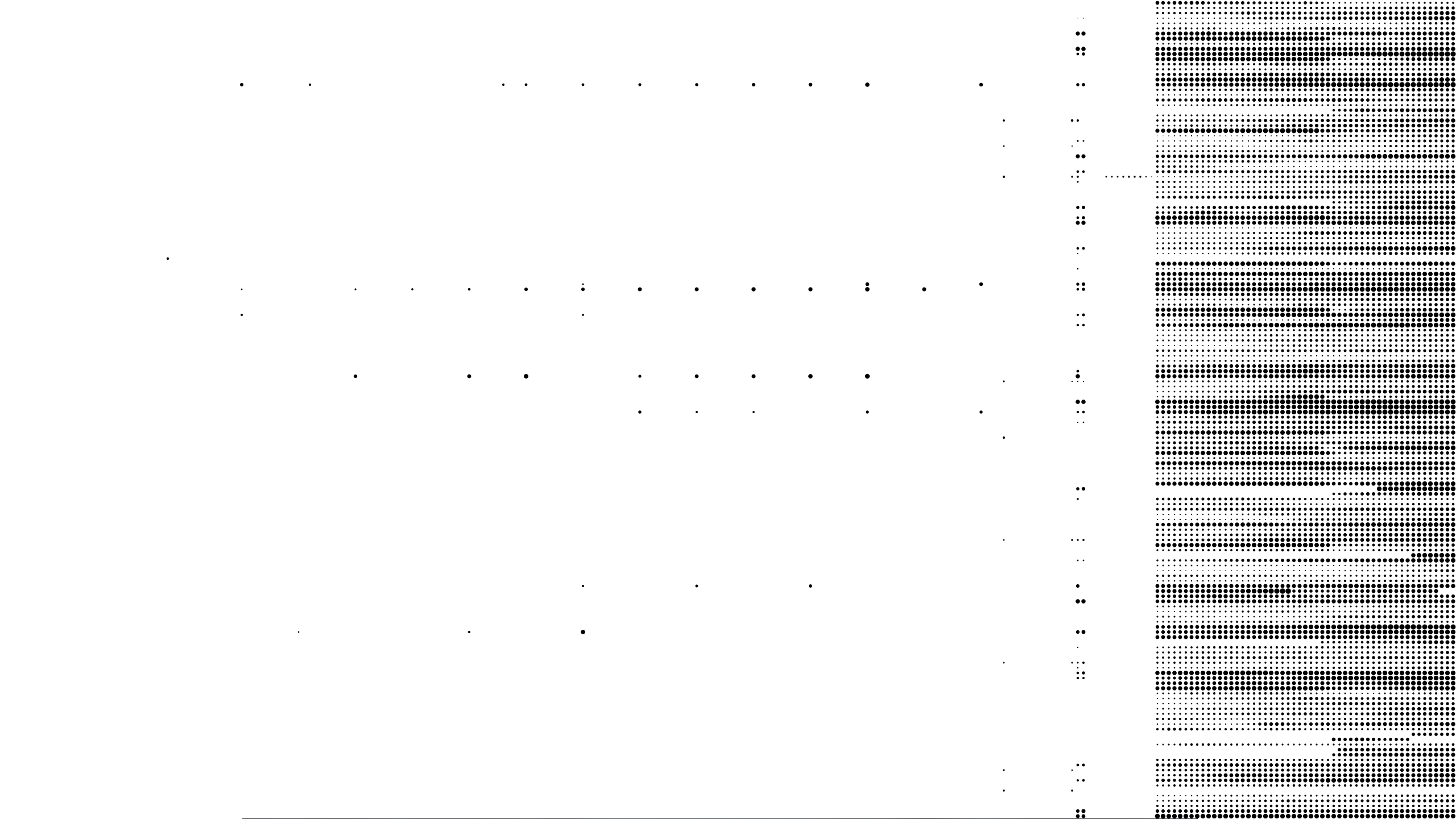
The first view shows my complete record. The rows represent the countries and the columns the years. In this view you can see that in the years before 1961 hardly any data is available. For this reason I removed them from my dataset.
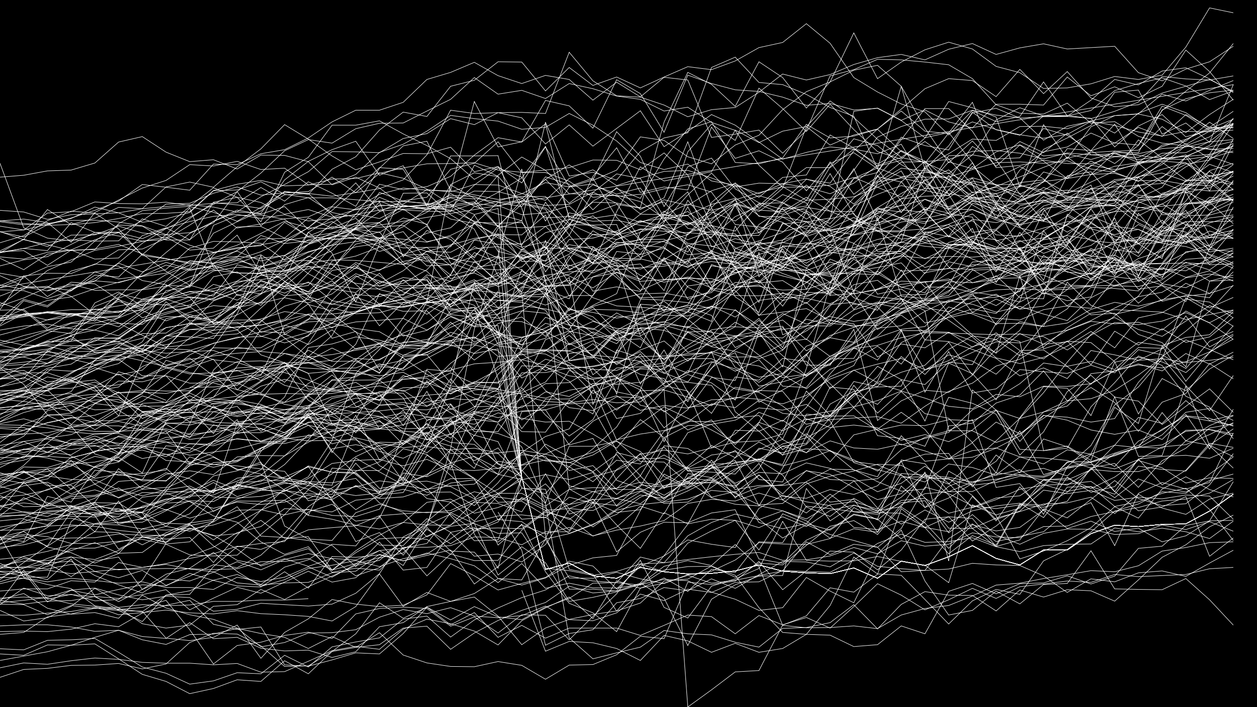
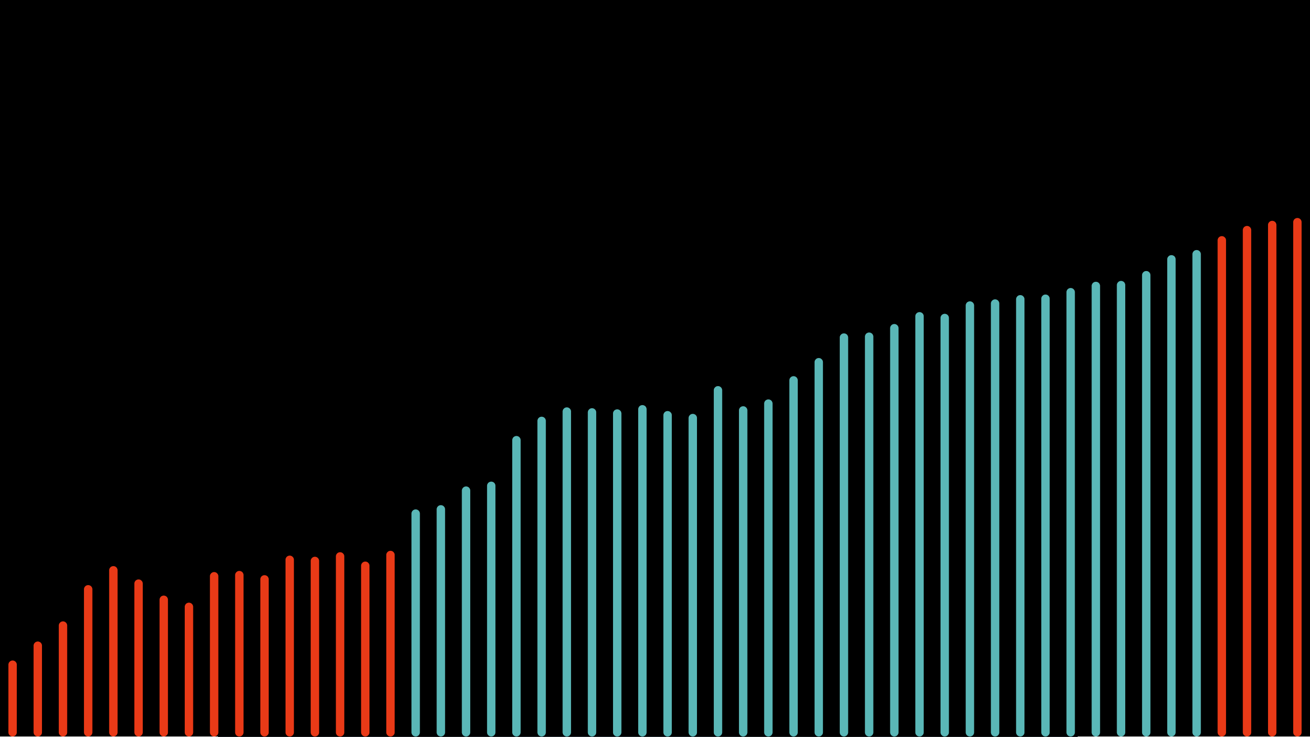
At my second approach to my dataset I had the information displayed in a coordinate system. The x-axis shows the years from 1961 to 2013 and the y-axis the kcal per day and person.
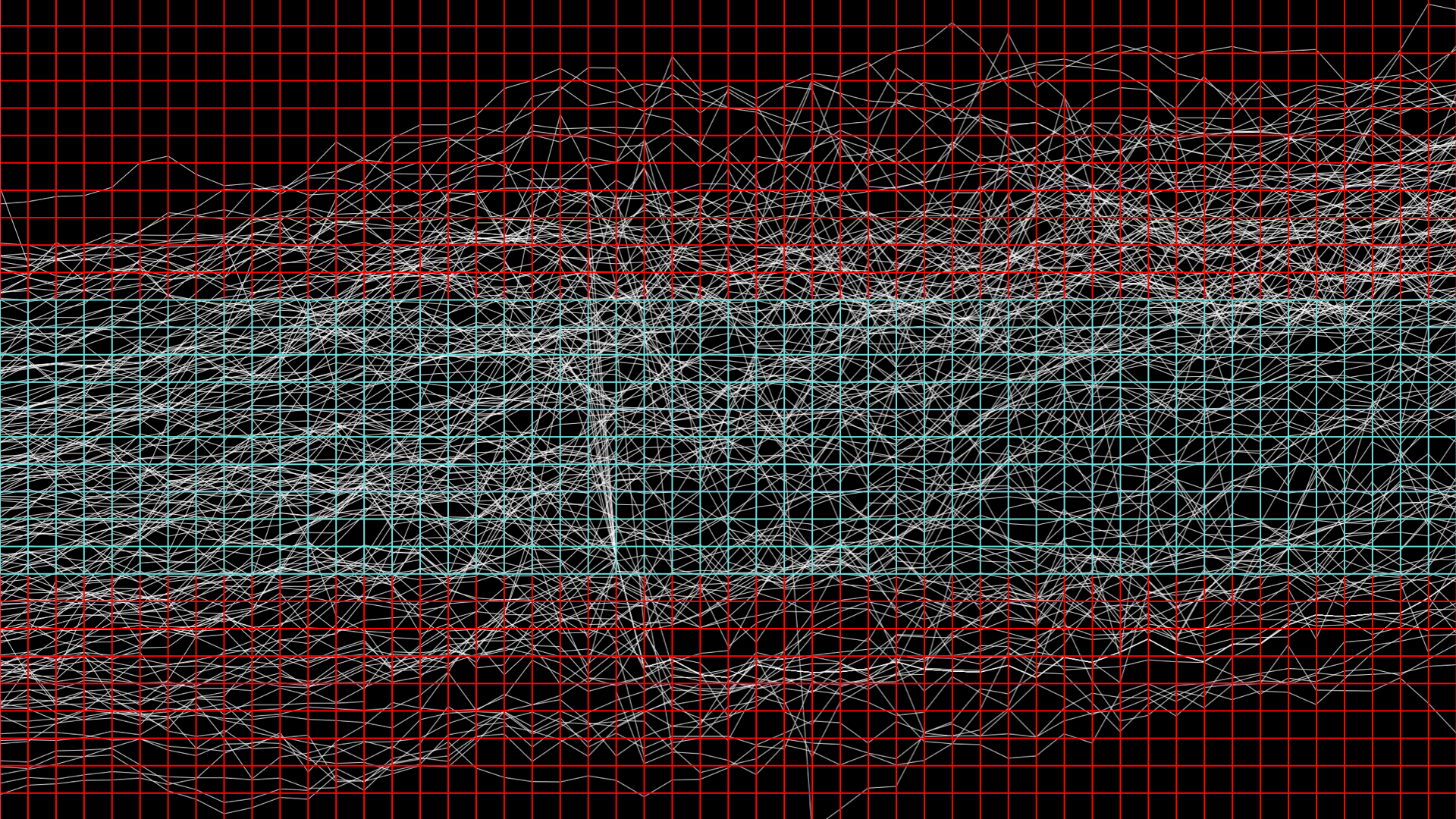
In the next step I placed a grid over the coordinate system. I use this for the determination of the number of countries within the tiles.

I use the certain amount to control the opacity. In other words, if the number of countries within the tile is low, I kept the opacity accordingly low, if the number of countries is high, this also corresponds to the opacity.

If you now select a tile, the same process takes place, only that here only the countries are used, which run through the selected tile.


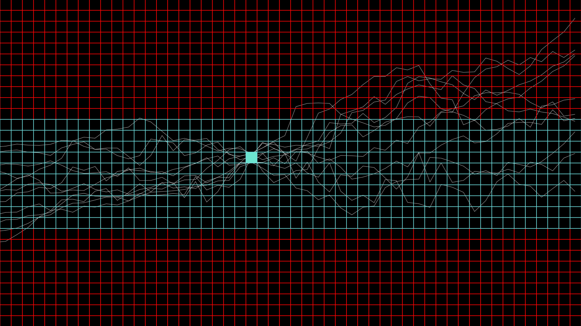
Click on a tile to get the view of the individual countries. From this tile a bar will open, which shows me every single country that runs through this tile.
My lowest level shows a bar chart that shows the information of a selected country.